40 Dreamy Front Door Color Ideas to Try This Season
- Classic Black
- Cheerful Cherry Red
- Deep Navy Blue
- Soft Sage Green
- Buttery Yellow
- Muted Terracotta
- Classic Forest Green
- Coastal Turquoise
- Warm Charcoal Gray
- Bold Plum Purple
- Crisp White
- Rich Burgundy
- Dusty Blue
- Bright Coral
- Matte Black with Warm Undertones
- Olive Green
- Sunny Mustard
- Slate Blue-Gray
- Deep Teal
- Warm Taupe
- Bright Kelly Green
- Almost-Black Espresso Brown
- Soft Blush Pink
- Deep Aubergine
- Classic Barn Red
- Cool Ice Blue
- Rich Chocolate Brown
- Vibrant Fuchsia
- Muted Sage Gray
- Classic Hunter Green
- Warm Apricot
- Deep Indigo
- Soft Seafoam
- Classic Colonial Blue
- Warm Cinnamon
- Bright Cobalt Blue
- Soft Dove Gray
- Rich Emerald Green
- Classic Butter Cream
- Moody Wine Red
- Fresh Mint Green
40 Dreamy Front Door Color Ideas to Try This Season
Your front door gets more attention than almost any other spot on your house, and most of us leave it painted whatever boring beige or brown it came with. That’s a missed opportunity. A fresh coat of color on your entry door is one of the cheapest, fastest ways to boost curb appeal, and it genuinely changes how your whole house reads from the street.
Below are 40 front door color ideas to get you thinking beyond basic black or the same red everyone else on the block already has.
Classic Black
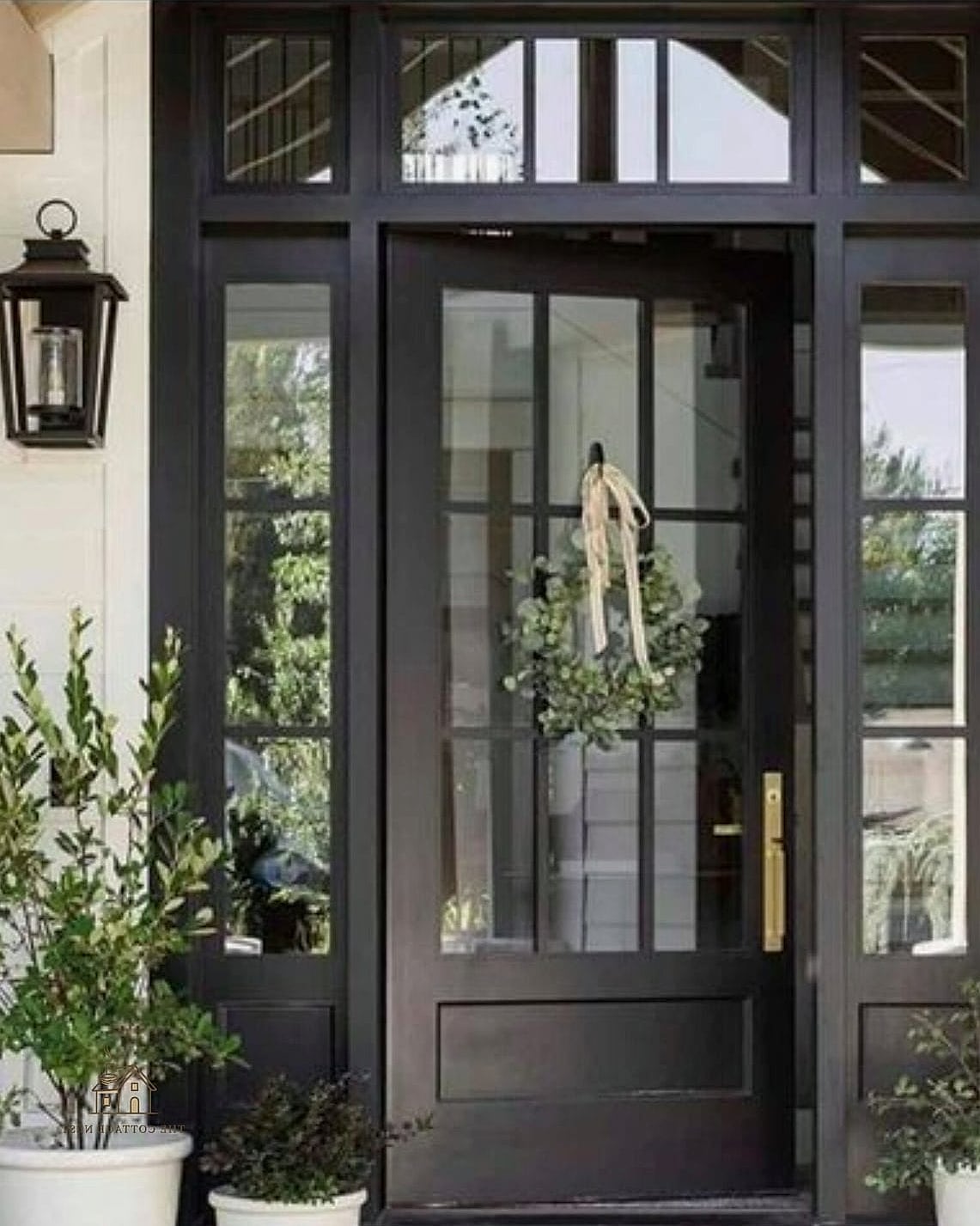
Black is the front door color that never really goes out of style, and it works on nearly every architectural style from colonial to modern farmhouse. It reads as sophisticated without trying too hard, and it pairs beautifully with brass or matte black hardware. The only downside is that black shows dust and pollen more than lighter shades, so plan on wiping it down every so often.
Cheerful Cherry Red
A true cherry red door says “welcome” louder than almost any other color out there. It’s especially striking against white or gray siding and has long been associated with hospitality in home design traditions. Go with a satin or semi-gloss finish so it catches light nicely in the afternoon sun.
Deep Navy Blue
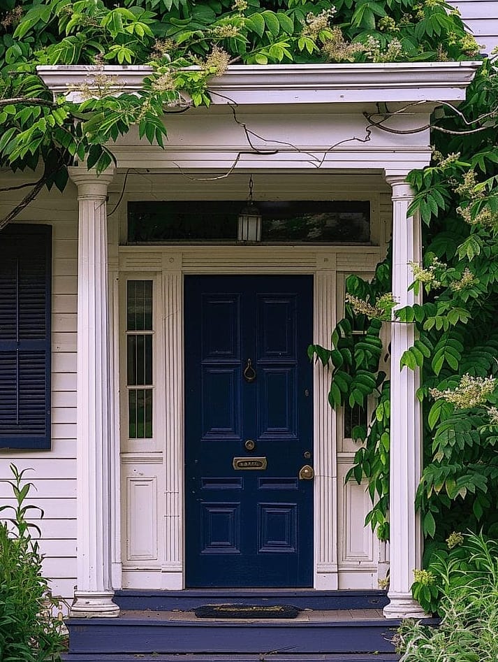
Navy has become one of the most requested front door colors in the last few years, and for good reason. It’s moody and elegant without being as stark as black, and it looks incredible next to natural wood tones or brick exteriors. This shade also tends to hide small dings and scuffs better than brighter colors.
Soft Sage Green
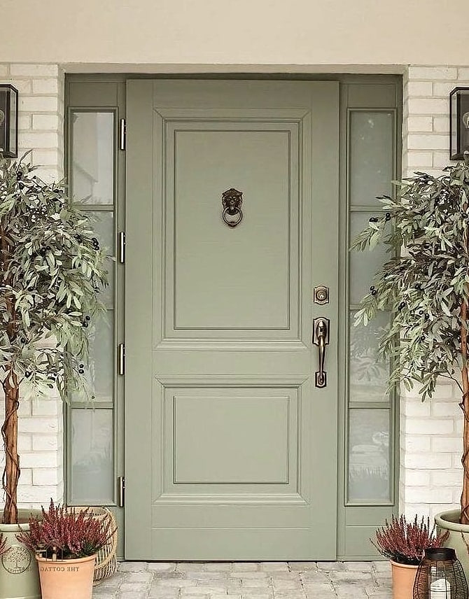
Sage has been showing up everywhere lately, from kitchen cabinets to front doors, and it’s easy to see why. It’s calming, earthy, and pairs well with just about any siding color, especially white, gray, or warm wood accents. This is a great pick if you want something trendy but not loud.
Buttery Yellow
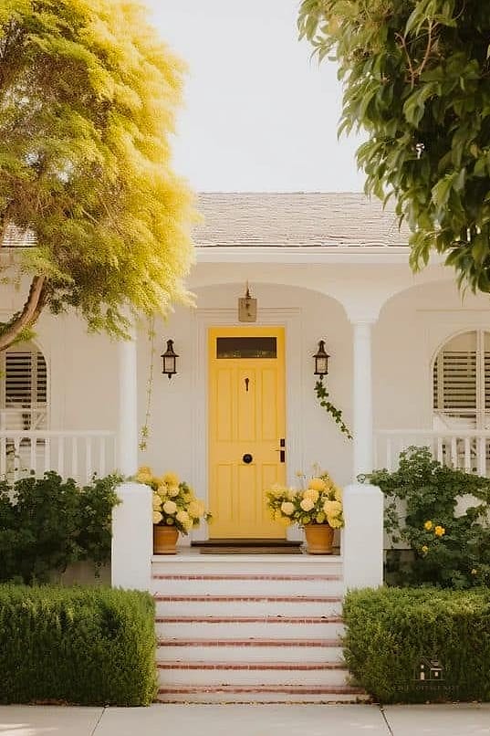
A soft, buttery yellow door instantly makes a home feel warmer and more inviting, almost like sunshine even on a cloudy day. It works particularly well on cottage-style homes or anywhere you want a cheerful, welcoming vibe. Pair it with white trim to keep it looking crisp rather than overwhelming.
Muted Terracotta
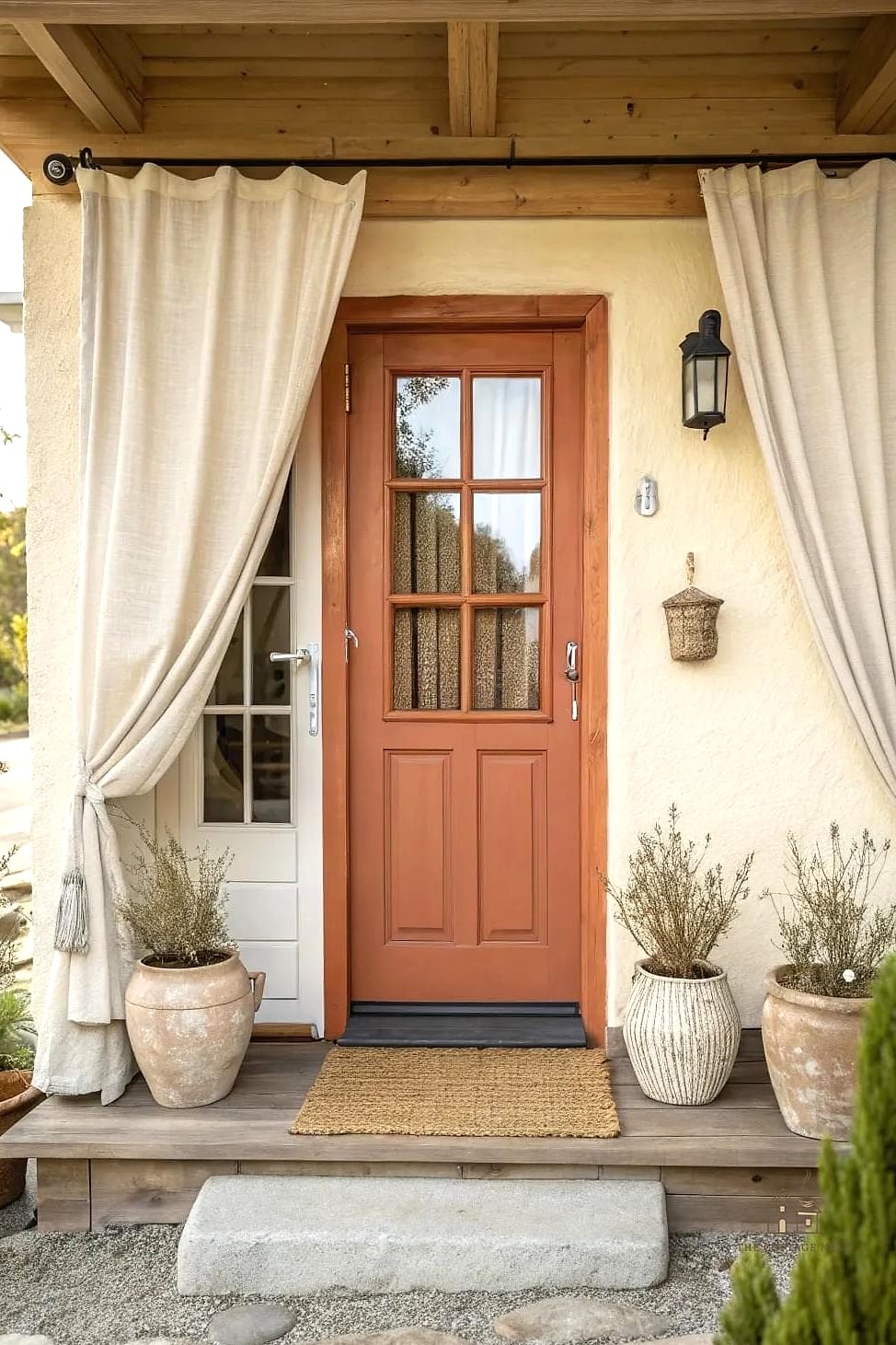
Terracotta brings warmth without being as bold as bright orange, and it has a lovely earthy, sun-baked quality to it. This color shines on Spanish-style, adobe, or Mediterranean homes, but honestly it can work on a lot of styles if your exterior has warm undertones. It’s a nice alternative if you love orange but want something a little more grown-up.
Classic Forest Green
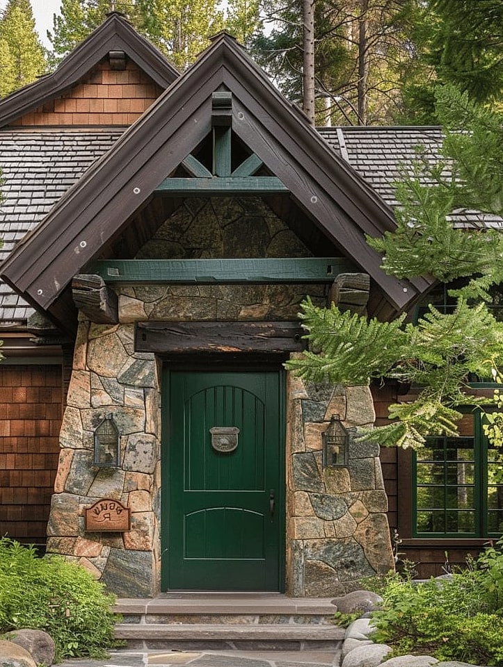
Forest green is timeless in a way that’s hard to overstate, and it looks especially good against brick or stone exteriors. There’s something about a deep green door that feels like it belongs in an old English countryside cottage, even on a newer build. Hunter or bottle green shades tend to age gracefully and don’t feel trendy in a way that dates quickly.
Coastal Turquoise
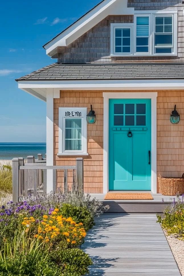
If you want your door to feel like a little vacation every time you walk up to it, turquoise is the answer. This works especially well on beach houses, coastal cottages, or anywhere with a laid-back, breezy feel. Pair it with white or light gray siding so the color really gets to shine.
Warm Charcoal Gray
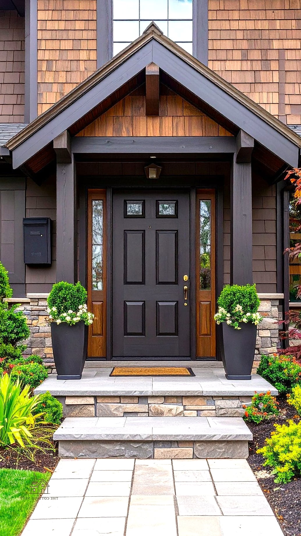
Charcoal is a softer alternative to pure black, with a bit more warmth and less stark contrast. It’s incredibly versatile and works with almost any siding color, which makes it a safe pick if you’re not ready to commit to something bold. This shade also tends to hide dirt better than lighter grays.
Bold Plum Purple
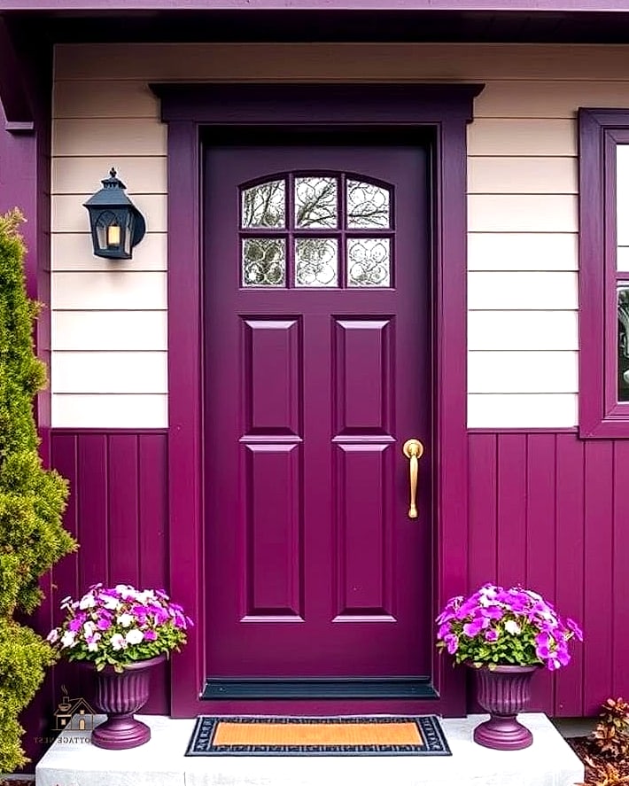
Plum is unexpected in the best way, and it adds a rich, almost jewel-toned quality to your entryway. It works surprisingly well on modern homes with clean lines, especially when paired with black hardware and simple landscaping. Just make sure to test a sample first since purple can shift dramatically depending on the light.
Crisp White
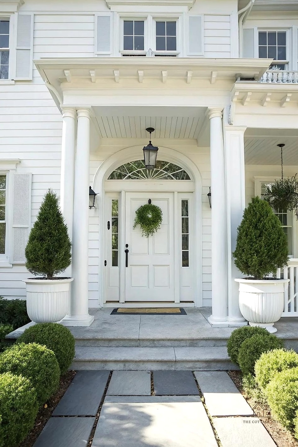
A white front door feels fresh, clean, and a little bit classic, especially against darker siding like navy, black, or deep gray. It’s an easy choice if you want your door to blend rather than stand out, letting other exterior details take center stage. Keep in mind white shows scuffs and handprints more than darker shades, so you may need to touch it up more often.
Rich Burgundy
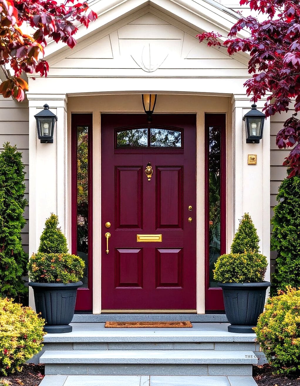
Burgundy has a wine-like depth that feels elegant without being flashy, and it looks stunning against brick homes especially. This color has a slightly old-world charm to it, reminiscent of traditional East Coast homes. It’s a nice middle ground if red feels too bold but you still want warmth.
Dusty Blue
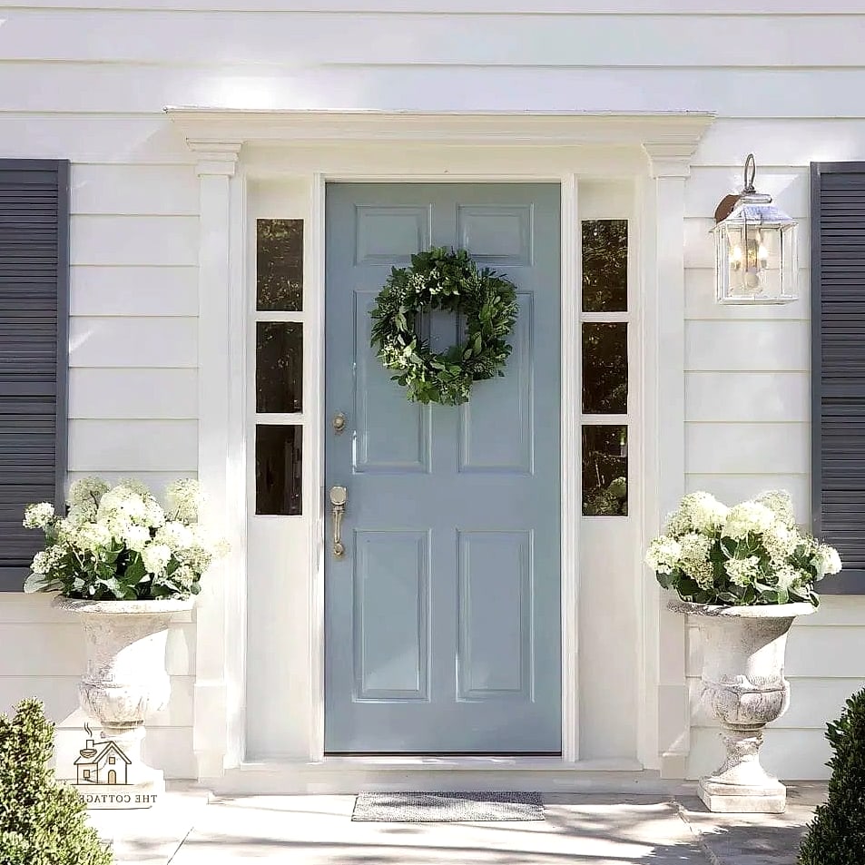
Dusty blue is softer and more muted than navy, giving off a relaxed, almost vintage farmhouse feeling. It works beautifully on cottage-style homes and pairs nicely with white trim and natural wood porch furniture. This shade also photographs really well, which matters if curb appeal is part of why you’re doing this.
Bright Coral
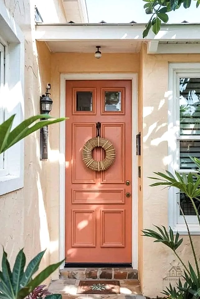
Coral brings energy and warmth in a way that feels playful rather than overwhelming. It’s a great option for warmer climates or homes that already lean toward a fun, beachy aesthetic. This is one of those colors that makes your house instantly recognizable on the block, which some homeowners love.
Matte Black with Warm Undertones
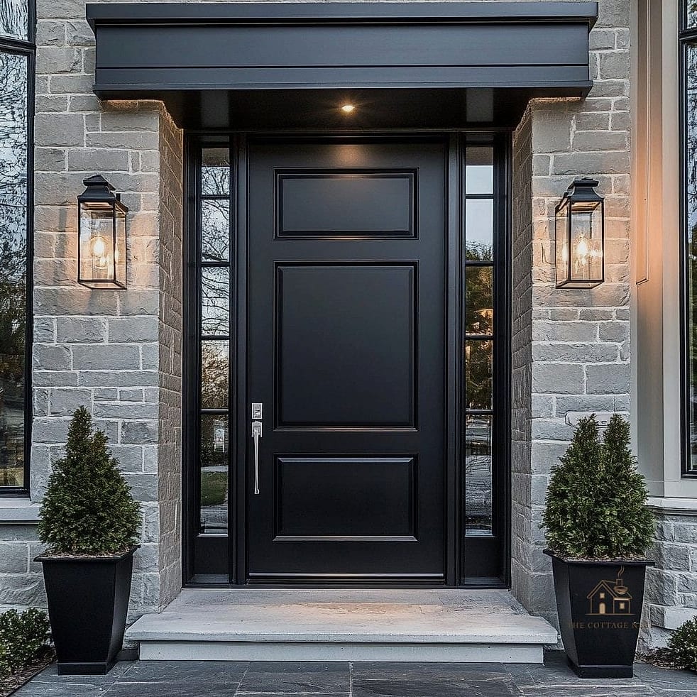
Not all blacks are created equal, and a matte black with slightly warm undertones feels different from a stark, cool black. This softer take pairs beautifully with wood tones and brass hardware, giving a more organic feel than a pure jet black. It’s especially popular right now on modern farmhouse and transitional style homes.
Olive Green
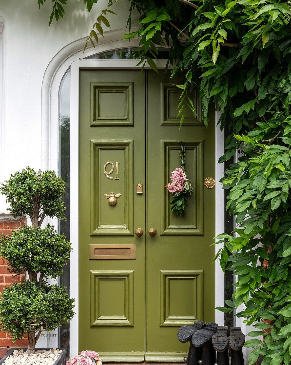
Olive has a slightly muted, vintage quality that feels different from brighter greens like emerald or kelly. It works especially well on homes with earthy, natural exteriors like stone or wood siding. This color has quietly become one of the more requested shades for front doors over the past couple of years.
Sunny Mustard
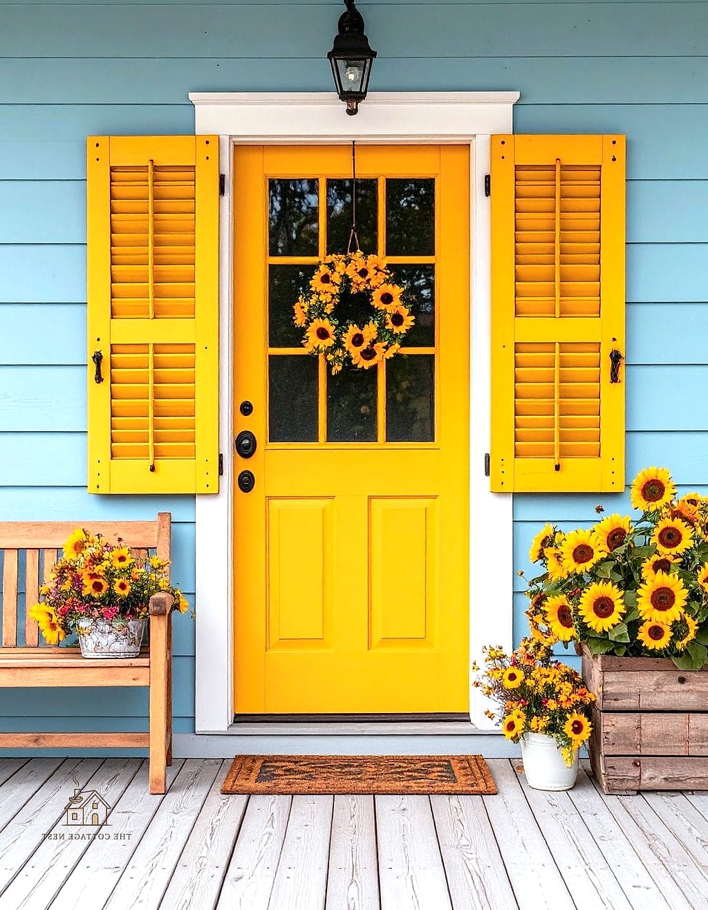
Mustard is bold, a little retro, and instantly adds personality to an entryway. It works particularly well on homes with neutral gray or white exteriors that could use a pop of unexpected color. This shade tends to work best in a satin finish rather than high gloss, which keeps it from feeling too shiny or plasticky.
Slate Blue-Gray
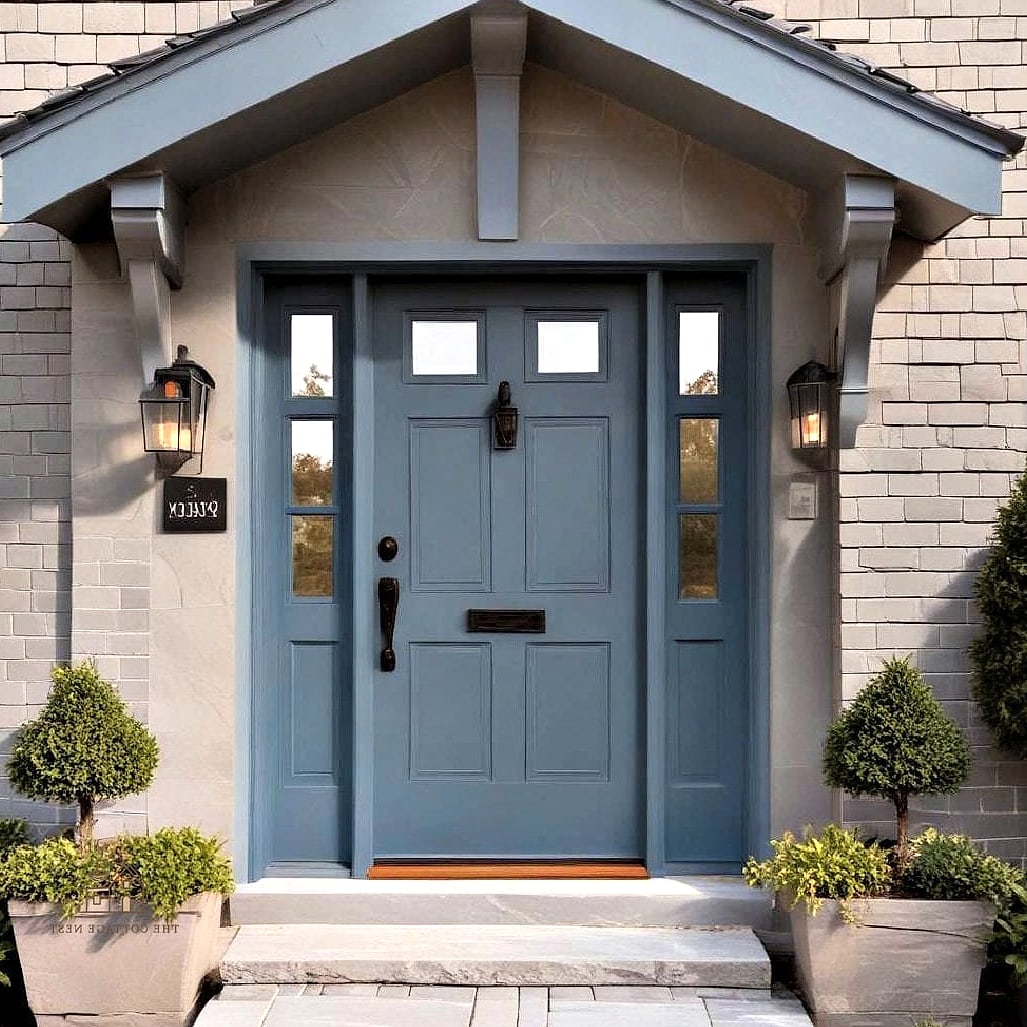
Slate sits somewhere between blue and gray, giving you a color that feels sophisticated but not as committal as full navy. It works with almost any exterior color scheme, which makes it a solid choice if you’re painting a home you plan to sell eventually. This shade also tends to look different throughout the day depending on the light, which some homeowners find really appealing.
Deep Teal
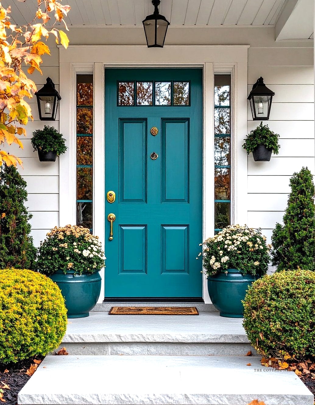
Teal has more depth and moodiness than turquoise, making it feel a bit more upscale and less beachy. It looks incredible against white, cream, or light gray siding, and it pairs beautifully with brass house numbers or a brass mail slot. This is a great option if you want something colorful but still elegant.
Warm Taupe
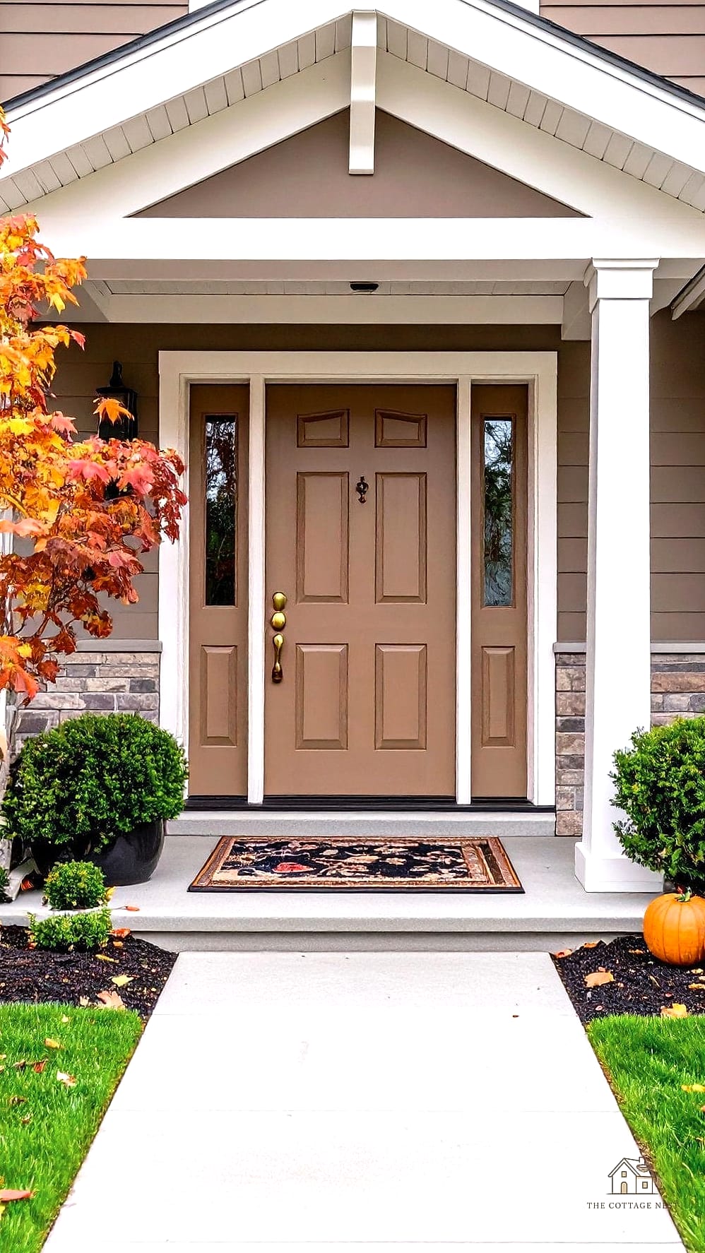
Taupe is one of those quiet, sophisticated colors that doesn’t scream for attention but still elevates the whole look of your entry. It’s an especially good choice for homes with warm-toned brick or stone, since it won’t clash the way a cooler gray might. This shade is also fairly forgiving when it comes to dirt and everyday wear.
Bright Kelly Green
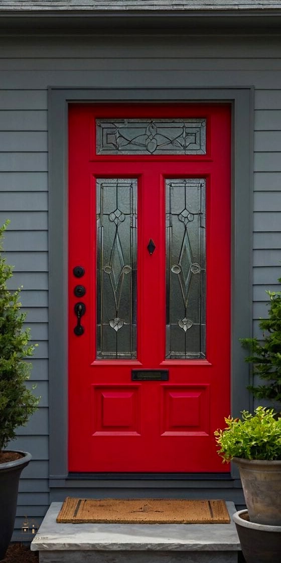
Kelly green is punchy, cheerful, and definitely makes a statement. It’s not for everyone, but on the right home, especially something with white or cream siding, it looks fantastic and full of personality. This is a fun choice if your house already has a lot of character and you want your door to match that energy.
Almost-Black Espresso Brown
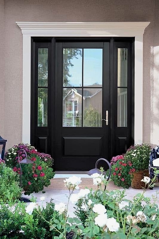
Espresso is a nice alternative if you like the drama of black but want something a touch warmer. It has a rich, coffee-like depth that pairs beautifully with natural wood elements and warm-toned brick. This shade tends to hide scuffs and dirt exceptionally well, which is a nice practical bonus.
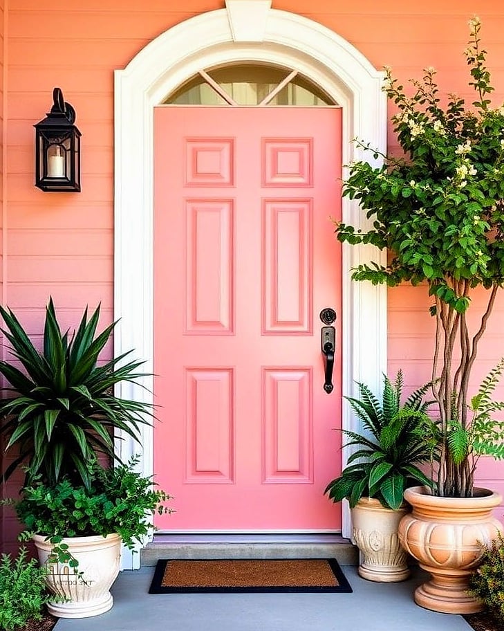
Soft Blush Pink
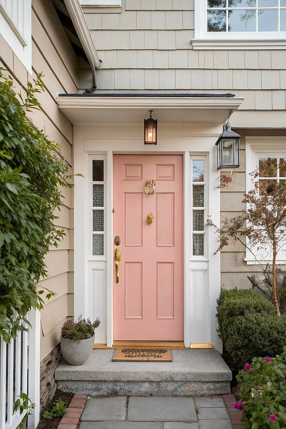
Blush pink has moved well beyond nurseries and into front doors, giving homes a soft, romantic touch. It works surprisingly well on cottage and Victorian-style homes, especially paired with white trim and greenery. Keep the surrounding landscaping simple so the door color doesn’t feel like it’s competing with anything else.
Deep Aubergine
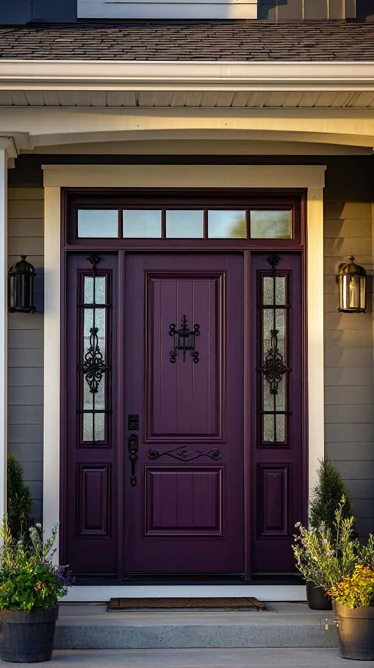
Aubergine is a dark, almost-black purple that reads as neutral from a distance but reveals its color in direct sunlight. It’s a sophisticated choice for homes that want something a little different from standard black or navy. This shade works particularly well with black or oil-rubbed bronze hardware.
Classic Barn Red
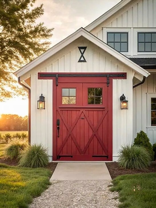
Barn red has a rustic, All-American quality that works beautifully on farmhouses, craftsman homes, and traditional colonials alike. It’s slightly more muted than a true cherry red, giving it a more grounded, earthy feel. This is a reliable choice if you want red but worry brighter shades might feel too loud.
Cool Ice Blue
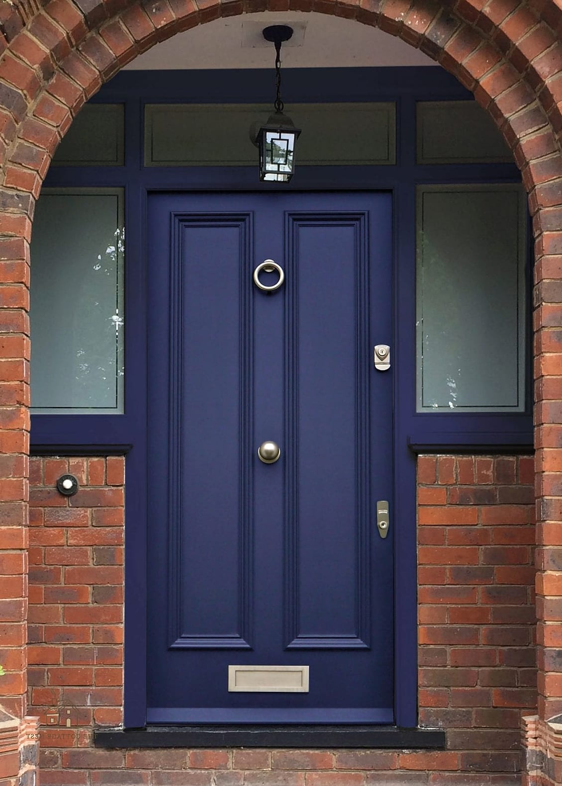
Ice blue is pale, crisp, and gives off a fresh, almost wintery feeling year-round. It works particularly well on homes with white or light gray siding, keeping the whole look airy and light. This shade tends to look best in a satin finish, which keeps it from feeling flat.
Rich Chocolate Brown
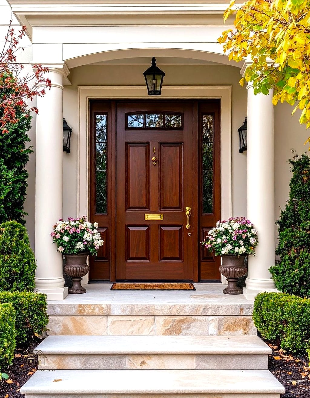
Chocolate brown is warm, grounding, and works especially well on homes with a lot of wood or stone detailing. It’s a nice option if you want something darker than beige but not as stark as black. This color also tends to be very forgiving when it comes to everyday dirt and weather exposure.
Vibrant Fuchsia
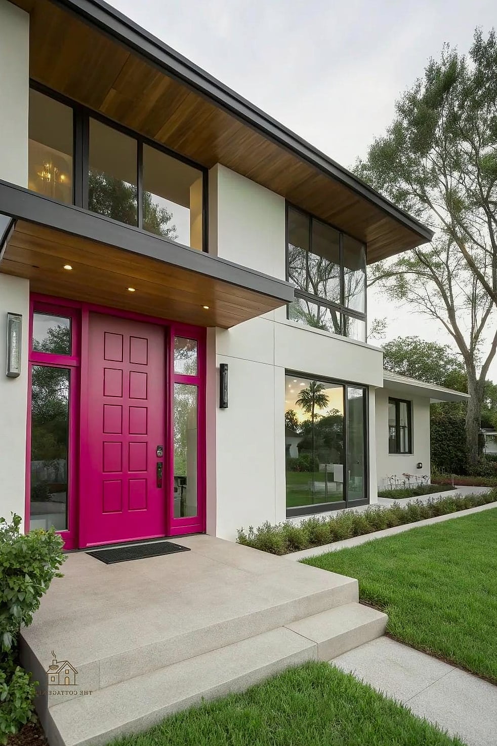
Fuchsia is bold, unapologetic, and definitely not for the faint of heart, but on the right home it’s absolutely striking. This works best on homes with simple, neutral exteriors that can handle a major pop of color at the entry. If you’re drawn to this shade but nervous about commitment, try it on a smaller feature like a mailbox first.
Muted Sage Gray
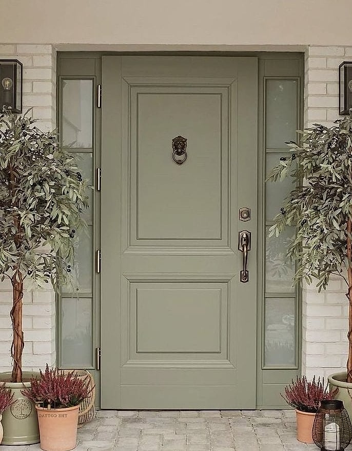
This is a quieter cousin of sage green, leaning more gray than green, which makes it incredibly versatile. It has an almost chameleon-like quality, shifting depending on the light and what’s around it. This shade has become a favorite among homeowners who want something soft and calming rather than bold.
Classic Hunter Green

Hunter green is darker and more saturated than forest green, giving it a rich, almost velvety appearance. It looks especially good on brick homes, where the warm red tones of the brick play beautifully against the cool green. This shade has serious old-money charm without feeling stuffy.
Warm Apricot
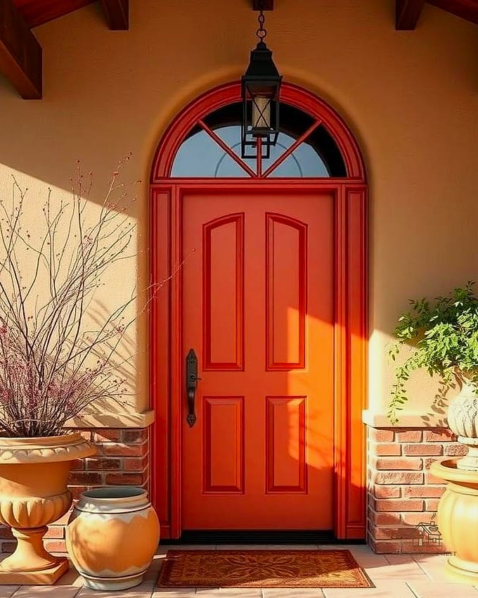
Apricot sits between orange and peach, giving you warmth without the intensity of a true bright orange. It’s a lovely option for homes that want something cheerful and a little unexpected. This shade works particularly well with white trim and natural wood porch elements like a bench or planters.
Deep Indigo
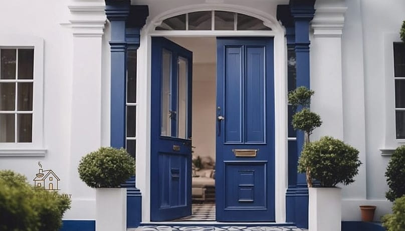
Indigo goes even darker and moodier than navy, almost bordering on black in certain lighting. It gives off a sophisticated, slightly dramatic feel that works especially well on modern and transitional homes. This is a great pick if you love the idea of black but want a hint of color to peek through.
Soft Seafoam
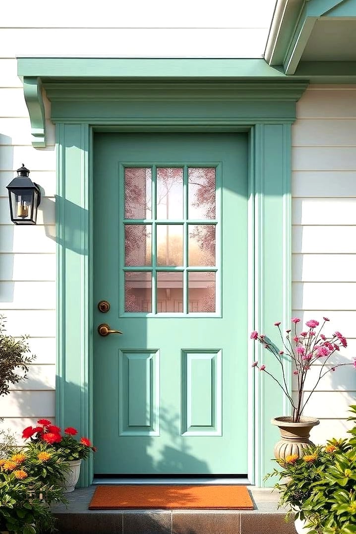
Seafoam is light, airy, and has just enough green in it to feel fresh without being as bold as emerald or kelly green. It’s a natural fit for coastal homes, but it also works surprisingly well on craftsman-style houses with a lot of natural wood. This shade pairs beautifully with white trim and simple greenery out front.
Classic Colonial Blue
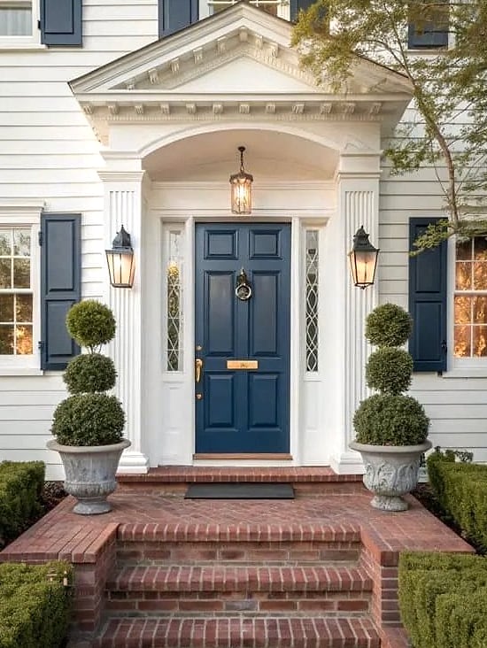
This is a slightly deeper, more traditional blue than navy, with historical roots in colonial-era homes. It works beautifully on traditional and historic-style houses, especially those with white trim and shutters. This shade has a timeless quality that rarely feels dated.
Warm Cinnamon
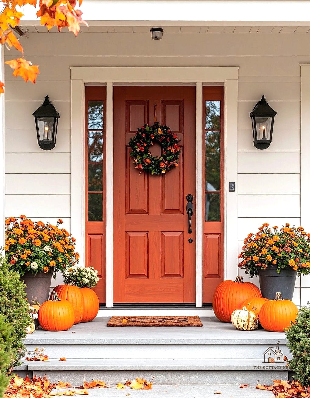
Cinnamon is a spicier, more saturated take on terracotta, with a bit more red mixed in. It’s a great choice for homes that want warmth and richness without going full orange or red. This shade looks especially good against warm-toned siding like cedar or natural wood.
Bright Cobalt Blue
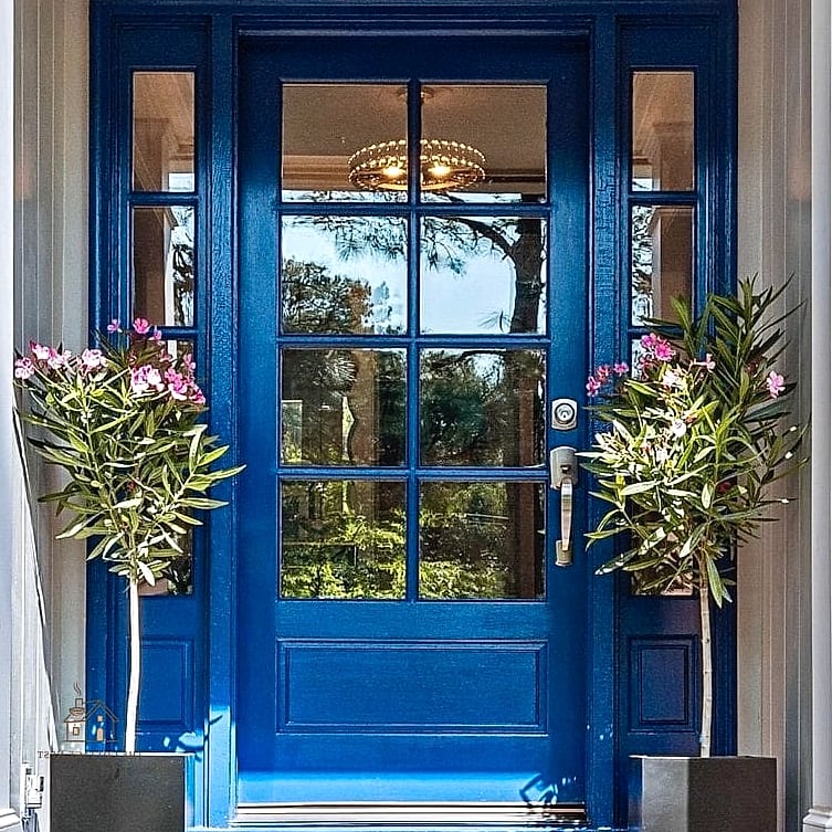
Cobalt is punchier and more saturated than navy, giving your entry a real burst of energy. It works especially well on homes with white or light-colored exteriors, where the contrast really gets to shine. This is a fun choice if you want your door to be the star of the whole house.
Soft Dove Gray
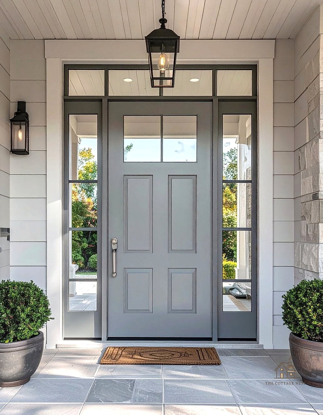
Dove gray is light, soft, and incredibly easy to pair with almost any exterior color scheme. It’s a great choice if you want a subtle upgrade from plain white without going too dramatic. This shade tends to work in nearly any lighting condition, which is a nice practical bonus.
Rich Emerald Green
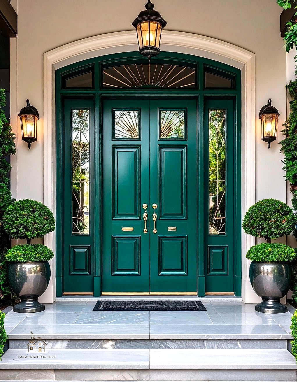
Emerald is bold, jewel-toned, and brings a real sense of luxury to an entryway. It looks incredible against white, cream, or light gray siding, and pairs beautifully with brass hardware and house numbers. This is a great option if you love green but want something with a bit more drama than sage or olive.
Classic Butter Cream
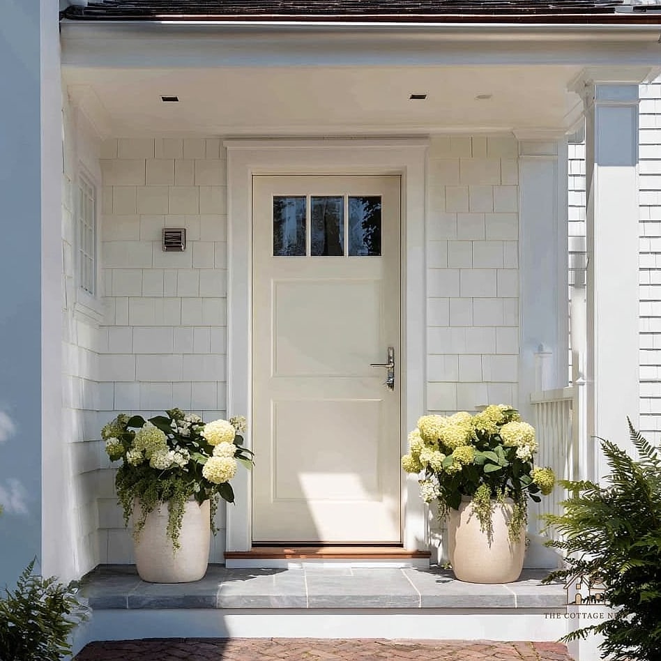
Butter cream is soft, warm, and a little nostalgic, especially on cottage or bungalow-style homes. It’s a gentle way to add color without straying too far from neutral territory. This shade pairs nicely with black or bronze hardware for a bit of contrast.
Moody Wine Red
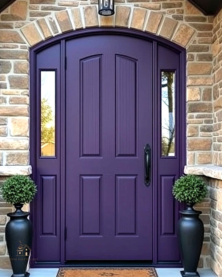
Wine red goes darker and more saturated than burgundy, almost bordering on a deep plum in certain light. It has a rich, luxurious quality that works especially well on brick or stone homes. This shade tends to look particularly striking in the evening under porch lighting.
Fresh Mint Green
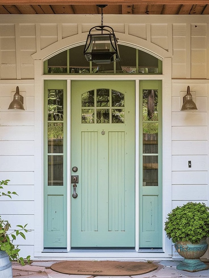
Mint is light, playful, and a little bit nostalgic, giving off vintage diner vibes in the best way. It works well on cottage and bungalow-style homes, especially paired with white trim and simple black hardware. This is a fun choice if you want something colorful but still soft and easy to live with.
Picking a front door color really comes down to what feels right for your home’s style and your own personality, since there’s no single correct answer here. Whether you go bold with emerald green or keep it classic with black, the best part about painting a door is that it’s a relatively small, affordable project with a huge visual payoff. Grab a few sample pots, paint some poster board, and hold them up against your house at different times of day before committing. Your entryway will thank you.